There is an old saying that says “figures lie and liars figure.” However, I don’t think it applies to the collection of eye-opening charts that I have provided a link to in today’s post.
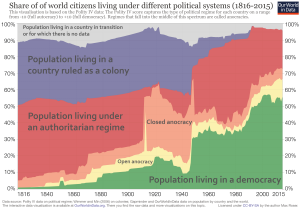
Among other things, these charts have adroitly added perspective to the statistics, facts, and figures that define and illuminate our world. I urge you to take a look at them (there are 10).
The charts are from howmuch.Net, a cost information website: https://howmuch.net/. The howmuch.net website contains dozens of similar charts that visually explain the economy, real estate, business, personal finance, cryptocurrencies, cost guides, etc.
Just click on the link below to see understandable visualizations about money, population, economies, world debt, language usage, largest companies, and most valuable brands, among other things.
You won’t be disappointed.


